

Gradnet Just Got a Whole Lot Easier to Use, Here’s What’s New

Tasnova Chowdhury
Tasnova Chowdhury is a Business Analyst & Content Writer at Technext and Product Marketer for Gradnet, with 3+ years of content writing experience and a background in Computer Science and Engineering. Drawing from her research into alumni engagement, fundraising, and membership retention, she writes practical guides on alumni events, mentorship programs, and community platforms for educational institutions.
Your community is only as strong as how easily people can find each other, show up for each other, and stay involved. We think about that every single day, and it’s exactly why we build.
That’s the heart behind this Gradnet platform update.
We’ve spent this cycle rolling up our sleeves and redesigning the parts of Gradnet your members touch every day, the Directory, Mentoring, the Job Board, Business listings, Events, Fundraising, the Gallery, and the Admin Panel. Our hope is simple: finding a fellow alum, requesting a mentor, or registering for a reunion should feel as easy and natural as it does catching up with an old friend.
Nothing here is decoration. Every change below started from one question we kept asking ourselves: how do we make it a little easier for your community to connect, show up, and stay engaged?
We’re genuinely excited about this one. Here’s everything that’s new, each section opens with a quick At a Glance summary if you’re short on time, followed by the full story.
Finding Each Other, Faster
Member Directory
At a Glance
- Members listed alphabetically
- New horizontal card layout
- Each card shows current job title, auto-updated from the member’s profile
This is the heart of Gradnet, so it’s the part we cared about getting right the most.
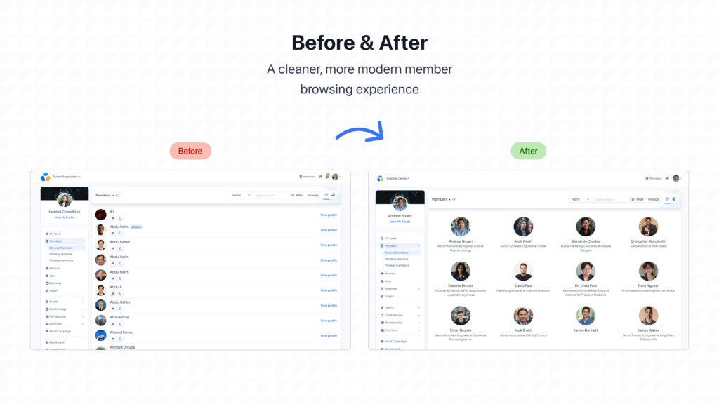
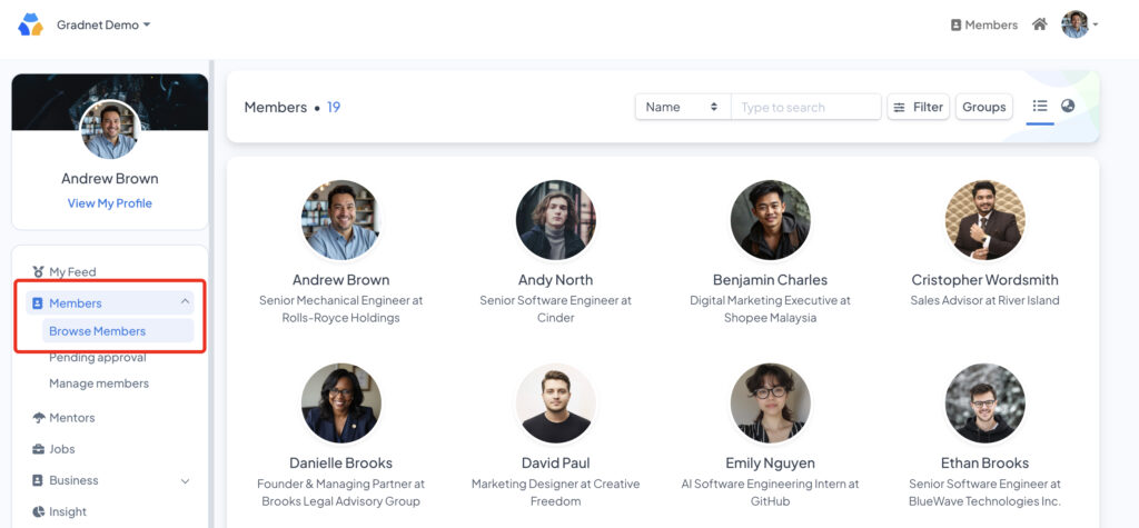
Members now appear alphabetically, in a clean horizontal layout that’s far easier to scan than a long vertical list. Every card shows the person’s name with current job title, pulled straight from their profile, and it updates the moment they do, with no admin having to lift a finger.
Think about what this replaces: someone scrolling through hundreds of names hoping to spot one classmate, or an admin fielding yet another message asking “is so-and-so still active?” Now that’s a five-second search, and everyone gets their time back.
Mentorship That Doesn’t Leave People Guessing
Mentor Directory
At a Glance
- New card-based layout for browsing mentors
- Mentorship request status is visible right on the card
- New filter sidebar to search mentors by topic
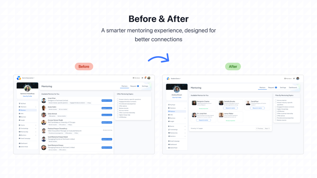
Mentoring only really works if people know where they stand. Nobody likes wondering whether their message got lost somewhere. So the new Mentor Directory shows your mentorship request status right on the card, whether it’s “Already requested” or “Request to mentor,” with no digging through old messages to check.
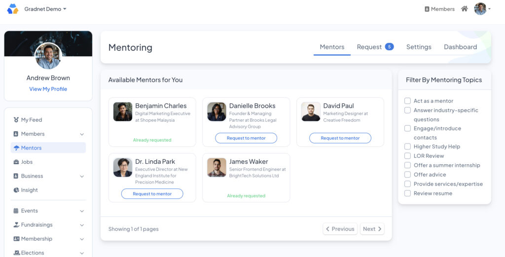
Mentors are now browsable as cards instead of a flat list, and a new filter sidebar lets you search by exactly what you need help with, by topics.
A Job Board Alumni Will Actually Check
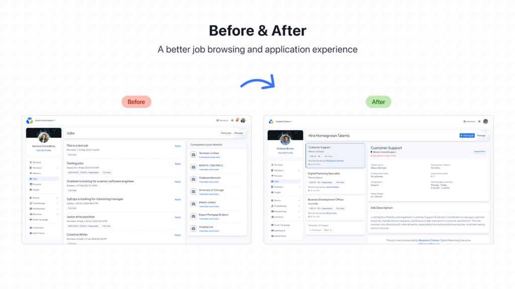
Job Board
At a Glance
- Scrollable card-based layout
- Each card shows role, company, salary range, and who recommended it
- Full job details open without losing your place on the board
Opportunities now live in a scrollable card layout, each one showing the role, company, salary range, and (this is the part we’re proud of) who in your community recommended it. That matters more than it might seem: a job board is only as trustworthy as the people vouching for what’s on it, and Gradnet has always been built around alumni looking out for each other.
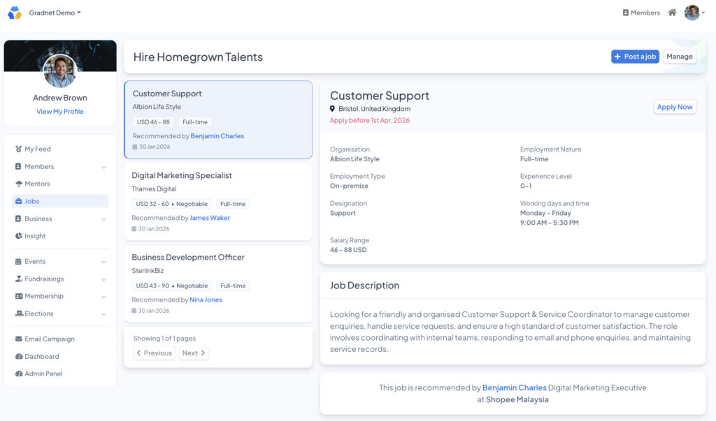
Clicking into a card opens the full picture: responsibilities, working hours, experience level, and salary, all without ever losing your place on the board.
Businesses Worth Discovering
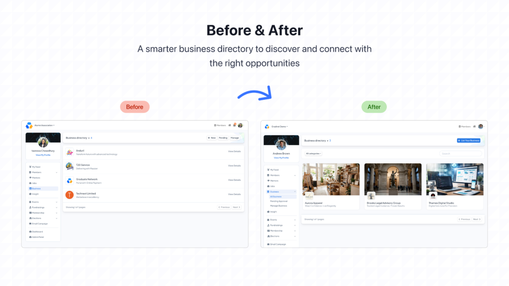
Business Directory
At a Glance
- New card-based layout with cover images and logos
- Every business gets its own dedicated details page
Your community’s businesses now get the presentation they’ve always deserved: a card-based directory with cover images and logos, and a full dedicated page for every listing.
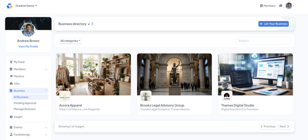
This is about more than looking nice. Every business on this directory belongs to someone in your network: a fellow alum, a graduate’s startup, a member’s family business. Making them easy to browse and easy to trust is how Gradnet turns community goodwill into real, everyday support.
Events, Organized the Way Your Community Actually Thinks
Event Listing
At a Glance
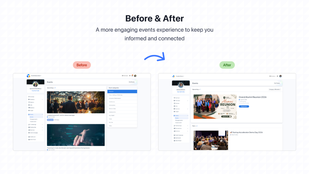
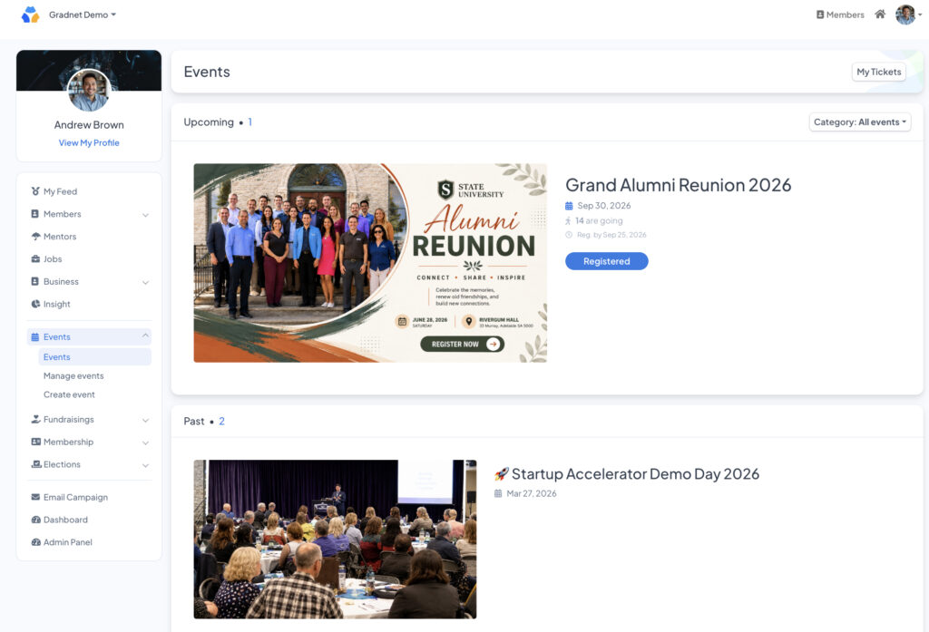
- Events split into Upcoming and Past
- Each card shows cover image, date, attendee count, registration deadline, and status
- New category filter
- New My Tickets button for instant access to registered events
Upcoming and Past events are now clearly split, and every event card shows what actually matters before you even click: cover image, date, how many people are going, the registration deadline, and whether you’re already signed up.
A category filter helps you jump straight to the kind of event you care about, and the new My Tickets button means you can find what you’ve registered for in one tap, no more digging through your inbox for a confirmation email you swear you saved somewhere.
If your team has ever gotten the message “wait, am I signed up for this?”, good news, that question pretty much answers itself now. For admins, that’s fewer messages to answer. For members, that’s one less thing to worry about before showing up.
Fundraising That Shows Its Impact in Real Time
Fundraising Campaigns
At a Glance
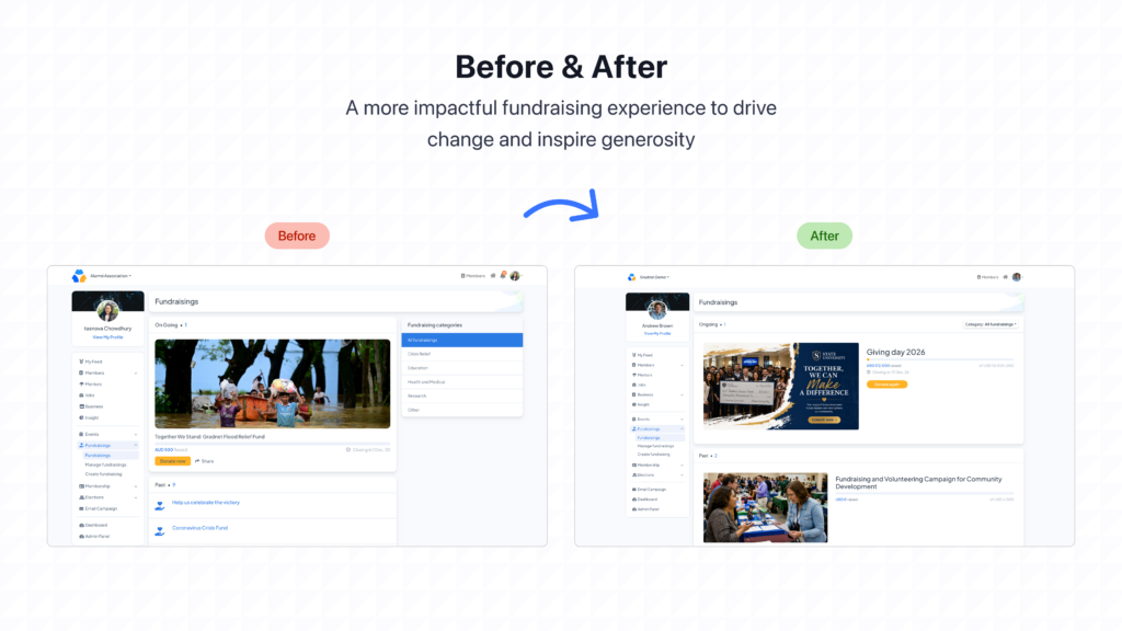
- Campaigns split into Ongoing and Past
- Each card shows amount raised, goal, and closing date
- New progress bar
- New category filter
Every campaign now runs as a large, visual card showing its cover image, amount raised, goal, and closing date, with a progress bar that shows exactly how close the campaign is to its target. Ongoing and Past campaigns are split clearly, and a category filter helps donors find the causes that speak to them.
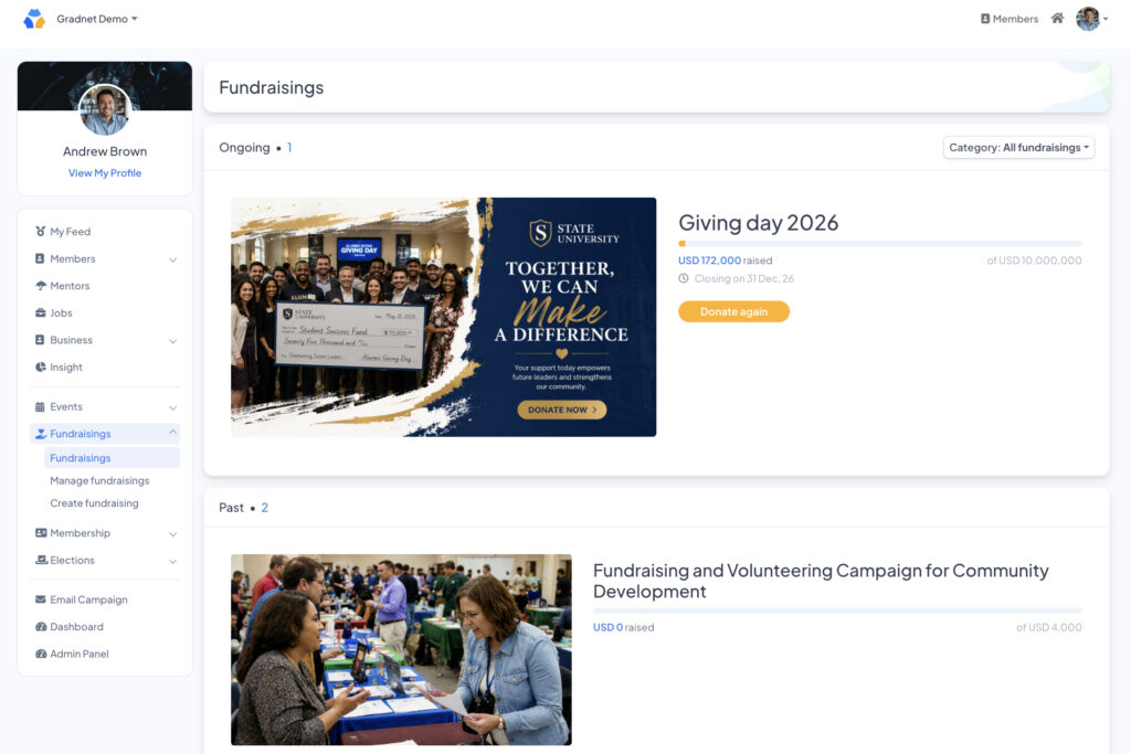
Fundraising has always been about trust and momentum. Watching a bar fill up toward a goal does something a plain number on a page never could. It turns giving into something you can see, share, and feel good about being part of.
One Platform, One Consistent Feel
At a Glance
- All banners and cover photos are standardized to 1920 × 1080 pixels
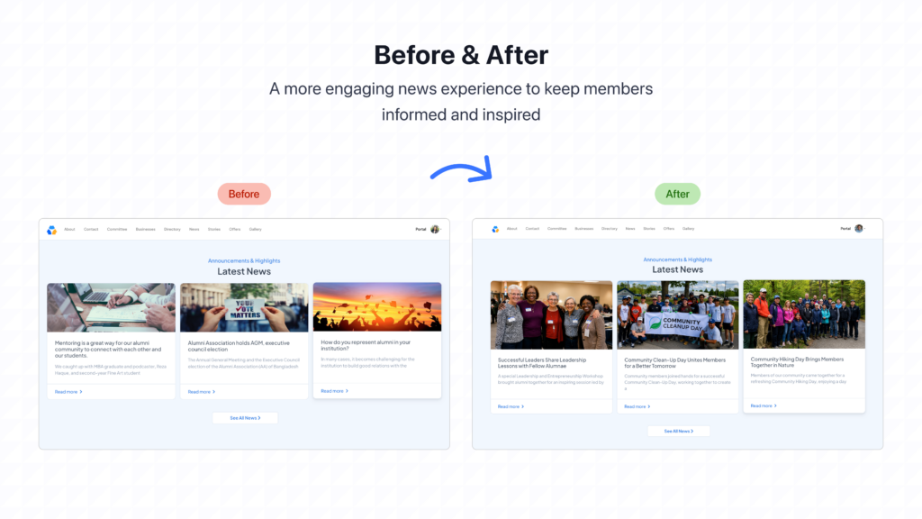
Small thing next, but it quietly affects everything else: every banner and cover photo (events, fundraising, news, stories) across your site is now standardized to 1920 × 1080 pixels.
It sounds minor. It isn’t. A community platform is a reflection of the community itself, and when every page looks intentional instead of thrown together, people trust it more, and they come back to it more.
Sharing Memories Without the Hassle
Gallery
At a Glance
- Upload multiple photos at once (up to 1 MB per image)
Admins can now upload multiple photos to the gallery in one go, instead of one painstaking upload at a time. Reunions, cleanup days, hiking trips: the little moments that actually make a community feel like a community are now so much faster to share.
An Admin Panel That Respects Your Time
Admin Panel
At a Glance
- Settings grouped into CMS, Finance, Administrations, and Other
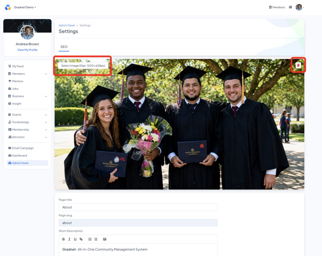
- CMS Settings now lets admins manage About/Contact cover images directly
If you manage a Gradnet community, this is the update you’ll feel every single day, and honestly, it might be our favorite one to hand over.
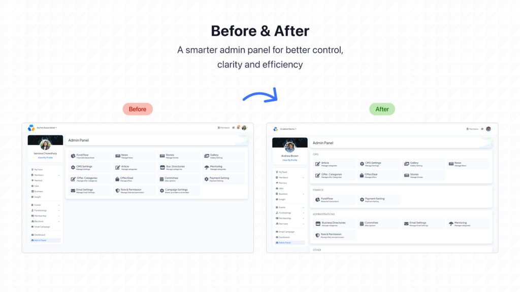
The Admin Panel is now organized into clear groups: CMS, Finance, Administrations, and Other, with every tool shown as a labeled tile with its own icon. Under CMS you’ll find Article, CMS Settings, Gallery, and News; under Finance, Fund Flow and Payment Setting; under Administrations, Business Directories, Committee, Email Settings, Mentoring, and Role & Permission; and under Other, Campaign Settings.
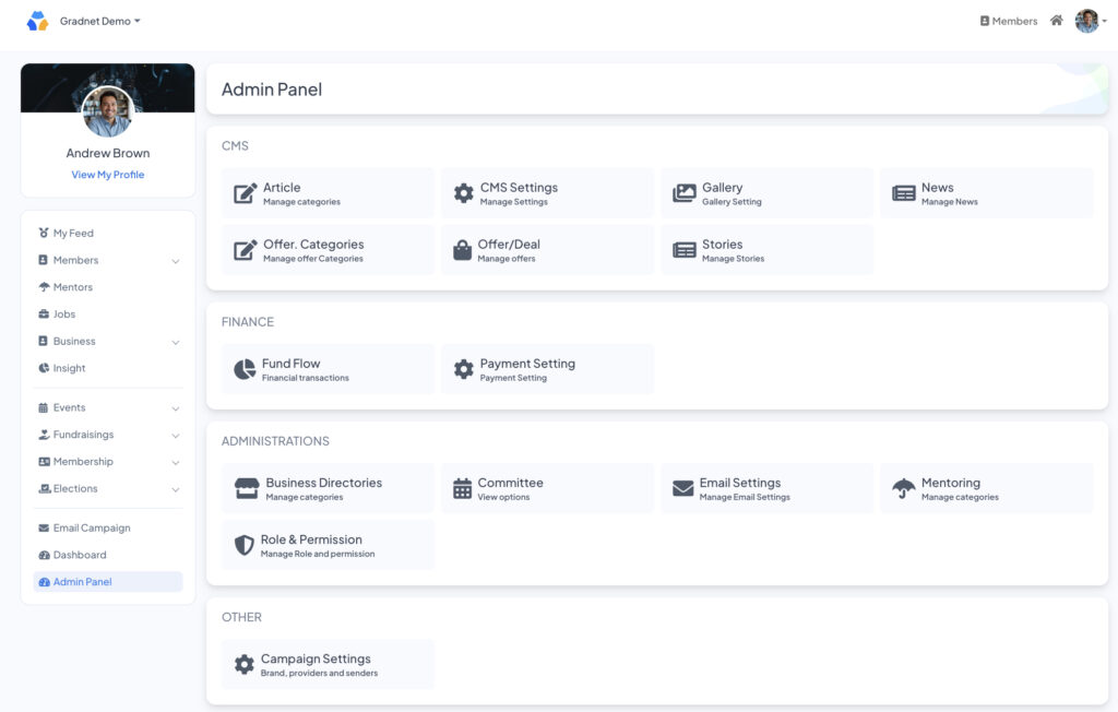
Instead of scanning an unlabeled list of settings and hoping you land on the right one, you now go straight to the category you need. What used to take a few clicks and a bit of guesswork now takes one glance.
CMS Settings: Update Your Own Cover Images
Path: Admin Panel → CMS Settings
You can now add, replace, or remove the cover images on your About and Contact pages directly. No waiting on a support ticket, no back-and-forth. A new team photo, a refreshed campus shot, an updated banner: it’s a self-serve change now, done in under a minute.
What This Update Is Really About
None of these changes exist for their own sake. A cleaner directory means more people reconnect. A clearer mentor status means fewer requests fall through the cracks. A visible fundraising bar means more people give. That’s the real return on a redesign like this: not a better-looking dashboard, but a community that’s just a little easier to be part of.
We’re not done, either. Gallery’s visual layout is next in line for the same card-based treatment, and we’re continuing to expand filtering across the Business and Job directories based on what admins have told us they need most.
As always, updates roll out gradually, so if something isn’t in your workspace yet, hang tight. It’s on its way.
Thank you for building your community on Gradnet. We built this platform to bring people together, and every single update we ship is in service of that. Nothing more, nothing less.
A Smarter Way to Build Community
Gradnet centralizes everything—members, events, and fundraising—so your community can grow effortlessly.